

At the Hot100 Workshop organised by Virtueel Platform at PICNIC 2010, we Paula van Akkeren, deputy head of design department of the NRC and I invited the ‘hottest’ young designers and artists to focus on online illustration. More specifically they were asked to focus on the quest of the NRC to develop new ways of illustration that would suit their online edition. NRC, the Dutch quality newspaper, is known for its frequent use of imaginative illustration in their printed edition and like many news media they yet have to find a way to do the same in the digital world. The question we asked them to ponder over was: ‘illustration in the online edition of the NRC, What could it look like?’

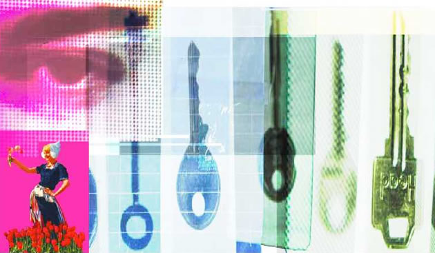
Illustration in magazines and newspapers today, perhaps could be described as the eye catching visual sidekick to the written word. Illustration, a small but significant player in the printed media, makes otherwise hard to digest pages of text negotiable and readable. In a multitude of styles and imaginative ways it points to the underlying meaning and hidden ideas, too complex or risky to be written in words. Where a journalistic photograph will be perceived as giving the reader facts and reality, illustration opens the more reflective and suggestive realms of the concept, story and opinion.
This relationship between text and image, between illustrator, editor and reader has been going for hundreds of years but with the shift towards digital platforms, without even the briefest of goodbyes illustration has been left to the side. Illustration, as a partner of articles or as an independent statement, has seemingly reached a point where it’s become obsolete. But perhaps it has reached a moment where it needs to be rethought in order to gain a (new) role and with it new potential.
Off course on an online page you can point at practical reasons why it’s easier to work with text alone rather than images, but as we all know from print, visuals attract, give different kinds of information and differentiates between articles. In other words visuals are a necessary part of the interface and today technically there are very few limitations for using them.
Already new ideas are put towards finding ways of presenting photography, but this is mainly applied to journalistic images and most often to create a separate platform showing the photographs independent from the written context. But how to bring text and visuals closer and more interconnected is still an under exploited area.
The Hot100 workshop was just one afternoon, only a short time to develop ideas. The focus therefore was on developing a format based on rethinking the role of illustration and how within online possibilities and demands this could be adapted. At the end of the afternoon, three interesting core ideas were presented; firstly illustration as a guide, secondly illustration as an information portal and lastly illustration as a contemplative moment.
In the first idea, illustration was shown as a visual timeline, for instance for an ongoing event such as elections or ongoing international conflicts. The timeline would be created from a multitude of images already available or commissioned especially during the ongoing event. The illustrations would be leading and through interaction disclose underlying textual information.
Already in 2004, Jonathan Harris developed an idea, which has a lot of interesting similarities. 10×10 is a site based on an hourly RSS feeds of several leading international news sources, it analyses the top news stories and by selecting a 100 corresponding images, it builds a kaleidoscopic picture of the present news in 10×10, a hundred, images. 10×10 celebrates the automated process, but you can imagine ways where the editor and image creator have a determining influence. Creating a longer term working relationship with one or more illustrators or perhaps introducing a ‘news-jockey’, a dedicated image editor making real-time collage, would make for a more focussed and engaged statement com timeline, which off course can then be presented in many interesting ways.
Secondly illustration as a portal, where the main illustration depicts the subject area as a whole and at the same time shows separate elements, still or moving, as points of entrée to related articles or sources. Such visual ideas are already often seen as part of a homepage or for instance children’s web games, but with could easily be appropriated to current events theme pages as we see for instance in the NRC online. No longer a list of links as the sole guiding factor, but visual icons placed in relationship to each other. An interesting example of image as information portal is ‘ Metamap Sadam Hussein 1937-2007’ by Tjebbe van Tijen, created for OOG, De Volkskrant 2007. This work is a very wide horizontal collage, which you need to navigate using the horizontal scrollbars. It shows a timeline depicting the life of Sadam Hussein, where each element of the collage links to a mass of hidden information.
The third idea was an appropriation of a new ’reader’ function in the browser Safari; this feature allows the reader to isolate a piece of text from its busy surroundings. Using this function allows illustration as an integral part of the article to be used in a more contemplative way, allowing deeper layers of the visual to come to the forefront during the process of reading. Whilst the text is scrollable, the illustration remains ‘still’ and a default element on the page. Playing with the reference to a sheet of paper, with a front – and backside of the page, allows the ‘backside’ to be the area for functionalities and options such as ‘send-a-friend’, ‘Facebook’ and related comments etc. In this last idea, as in the printed environment, illustration as a focal point to create a more readable page was brought into the online environment.
All of the formats touched upon in the workshop are not ‘new’ in themselves, on existing websites; visuals and illustration are already used in similar ways. Most of the technology to create these types of illustrations is available and no longer extremely specialised or complex to produce. New is the context of the news site and its particular editorial demands.
The field of editorial illustration is entering a new area, forming new combination of skills that come from editorial illustration and interaction design. Illustration might become more of a team effort; require the editor to commission in different ways and might need a more direct working relationship with writers and researchers.
There might no longer be a single deadline, but illustrations could be developed and published in several stages or even created in real-time, so more thought need to be given how to adapt to a more fluent production.
Traditional combinations of certain kind of article and image might no longer be appropriate or practical areas for illustration commissions, but in this workshop, already new editorial areas where illustration could have a binding, informing and guiding role were springing up.
Understanding the possibilities and value of illustration and the complexity of the new platform needs skills and insights and the collective expertise from editors, designers, and programmers and off course illustrators. But most importantly it needs a media platform that understands this value and is willing to dedicate attention and time to allow these hybrid visuals to be developed and tested.
With posing its question at the Hot100 workshop, The NRC understands the importance of illustration and it will place the outcomes of this workshop within the development process of her site. The hope is now for an opportunity to try it out!
Many thanks to Esther Jong, Jeroen Wielheesen, Edwin Verstraten, Casper Schipper, Raoul de Boer, Bree Tahahary, Danny Hoogendoorn, Maurice van de Ree and Sarah Janssen and Klaas Kuitenbrouwer – Virtueel Platform